The big moment finally arrived.
On Wednesday October 8, 2014, at the LC Pavilion in the Arena District, the Columbus Crew announced the upcoming retirement of the three construction workers and unveiled the much-anticipated new badge (beginning in 2015).
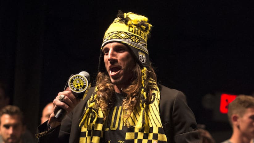
Former Crew defender and ubiquitous soccer broadcaster/culture-maven Brian Dunseth emceed the proceedings. MLS Commissioner Don Garber and Columbus Mayor Michael B. Coleman were among the distinguished guests. Frankie Hejduk did that thing where someone hands him a live microphone and he keeps saying Frankie stuff until such time as an intern is forced to quietly shoot him in the neck with a tranquilizer dart.
Most importantly, at the very first glimpse, the capacity crowd greeted the new badge with a roar of approval.
Back in 1995, I would often visit one of the student computer labs at Ohio University to search the new-fangled internet for information on the upcoming launch of Major League Soccer. I remember seeing a list of team names being considered for the ten inaugural franchises. Most teams had several possibilities under consideration. For example, I remember “Washington Justice” and “Washington Spies” being among the options for the team that would become D.C. United. Columbus, however, never changed. Its list never got bigger. There was only one rumored name—the Columbus Crew.
In my head, I pictured all of those aboard the Nina, the Pinta, and the Santa Maria. I figured it would be a tie-in to the city’s namesake and the team would use “Crew” to imply teamwork. After all, it takes more than one person to get three little wooden ships across the vast Atlantic Ocean.
In October of that year, MLS unveiled the identities of all ten clubs. The team from Columbus was indeed named the Crew. The logo consisted of a shield containing three construction workers. The colors were black and gold.
The name was neutral to me. I thought the logo was cartoonishly bad. The colors were downright awful from the perspective of a Clevelander who associates those colors with [NOTE: The next 510 words have been redacted out of respect to our fans with Pittsburgh ties.]
I can honestly say I wasn’t happy in October of 1995, but I quickly put all that aside. My home state was getting one of just ten MLS franchises, and that was going to be my team, even if I didn’t like the logo and the colors. Besides, looking at something called “the Kansas City Wiz” made me realize that it could have been much worse.
In the spring of 1996, I jumped at the opportunity to take a quarter off of school to do so a spring-summer internship in Columbus. In addition to real-world work experience, it would allow me to attend Crew games on a regular basis until I went back to school in the fall. My dad, a blue collar factory worker who proudly made the tungsten wire used in GE lightbulb filaments, even gave me a hardhat from work that I could wear to games if I were so inclined. (I did indeed wear it once or twice, trying in vain to get into the spirit of the logo.) But still, when the team first launched, the identity didn’t speak to me in any way. In fact, my dad was openly baffled by it. “Why does Columbus have a labor logo?” he would ask me. “It’s a bunch of bankers and politicians and professors and college kids down there. I didn’t see any factories.”
In retrospect, it’s funny to me that my dad in some ways presaged Anthony Precourt’s thoughts almost two decades later.
Despite my initial displeasure, the old Crew logo eventually came to mean a great deal to me. Obviously some of that is simply due to tradition and the passage of time. That was the logo worn by Brian McBride in the inaugural game when he and goalkeeper Bo Oshonyi combined on a field-length goal in which the ball never touched the ground. That logo graced the front of the shirt when Jeff Cunningham scored the first goal in Crew Stadium history and years later when he set the MLS all-time goal scoring record. It was the logo worn when Guillermo Barros Schelotto scooped the ball to Frankie Hejduk to seal the Crew’s 3-1 victory in MLS Cup 2008. It was also the logo associated with a Lamar Hunt U.S. Open Cup title and three Supporters’ Shields. It was logo sported by Brad Friedel and Stern John and Mike Clark and Duncan Oughton and Eddie Gaven and Kirk Urso and so many others. Heck, Dante Washington wore that logo during all three of his separate Crew stints. And it’s the logo of our current team’s lopsided five-game home winning streak, including a 4-1 thrashing of the otherwise invincible LA Galaxy.
Apart from eventual sentimentality, the logo began to connect with me in a literal sense too. When I did my internship in 1996, I lived on campus and had to drive past the Lane Avenue construction sites of the Schottenstein Center and OSU’s Fisher College of Business every morning on my way to work. My internship (which turned into my first post-college job) was at the Tuttle Crossing exit of 270 in Dublin. When I first interviewed, there were a few office buildings, a Wendy’s, a couple of gas stations, and lots and lots of cornfields. Seemingly overnight, up went condos and restaurants and stores. One of the giant cornfields became the Mall at Tuttle Crossing, the construction of which we could observe from the third floor of our office building. There was construction everywhere I looked when I first moved to Columbus, and where there is construction, there are hardhats.
Sure, every town has construction, but this felt different. This wasn’t the “let’s repair our crumbling and neglected infrastructure” type of construction. This was rampant new-build construction. This was “yowzers, we need to expand and re-engineer our roadways to accommodate all of this exponential growth” construction. The construction I witnessed was about building the future, not repairing the past.
The Crew’s logo became truly emblematic of that with the construction of Columbus Crew Stadium. I had the honor of being on-site at times during its construction, meaning I had to wear—you guessed it—a hardhat. And everywhere I looked, the people working as a team to do the actual work of building the stadium, they obviously wore hardhats too.
I still have some photos I snapped during a visit in the early spring of 1999 (click to enlarge).
<a href="/sites/columbus/files/scan0002.jpg" target="_blank"><img alt="" src="https://columbus-mp7static.mlsdigital.net/mp6/scan0002.jpg" style="width: 100%;"></a> |
<a href="/sites/columbus/files/scan0003.jpg" target="_blank"><img alt="" src="https://columbus-mp7static.mlsdigital.net/mp6/scan0003.jpg" style="width: 100%;"></a> |
<a href="/sites/columbus/files/scan0004.jpg" target="_blank"><img alt="" src="https://columbus-mp7static.mlsdigital.net/mp6/scan0004.jpg" style="width: 100%;"></a> |
<a href="/sites/columbus/files/scan0005.jpg" target="_blank"><img alt="" src="https://columbus-mp7static.mlsdigital.net/mp6/scan0005.jpg" style="width: 100%;"></a> |
<a href="/sites/columbus/files/scan0006.jpg" target="_blank"><img alt="" src="https://columbus-mp7static.mlsdigital.net/mp6/scan0006.jpg" style="width: 100%;"></a> |
Look at all those hardhats. From that moment forward, in my mind, the Columbus Crew logo became the construction workers who built Crew Stadium. And the building of Crew Stadium was Lamar Hunt and the Columbus Crew—and every single one of those real-life construction workers—literally building the future of soccer in America.
And all of that came together in this photo I snapped of Lamar Hunt during the stadium’s open house a week before the inaugural game:
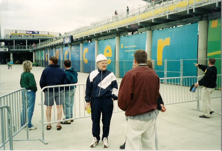
Yep. The Crew’s logo finally had true meaning to me.
Just because the Crew’s logo had true meaning to me, it doesn’t mean it had true meaning to everyone. I had infused that logo with meaning based on my own personal experiences. A random person off of the street would find no such meaning. And how could they? The original logo does nothing at all to answer some very basic questions important to a sports team’s identity—Who? What? Where?
People in Columbus would eventually come to know it meant the soccer team just from repeated exposure, but outside of Columbus, the logo could not have said less. A former Crew player once told me that when people at an airport asked if they were a rowing team, he would simply say “yes” because it was easier. (If he was in an actual MLS city, he would explain it was an MLS team from Columbus and they were in town to play the local MLS team, but in random airport conversation, it wasn’t worth the bother.) How could anyone outside of Central Ohio discern anything from the logo? It could be for anything. It offers no hints that it’s for a soccer team. Or that the soccer team plays in Columbus.
When the Crew started examining their brand, they found that the logo didn’t resonate with the people of Columbus and didn’t register at all with people outside of the market. One almost had to be in the secret Crew club to feel any sort of connection to it. And even then, millennials—a group that I can call “young whippersnappers” now that I’m 40—felt no connection to the hardhat logo, even though they loved the name and colors.
The Crew set out to fix all of that.
First, a word about leaks. Whether it’s new uniforms or new logos, leaks often happen. To pull off an event like the Crew did on Wednesday, the club can’t keep the logo to itself. They need to send the image to all manner of outside suppliers and partners, whether it be adidas to make the merchandise, Spacejunk Media to make the video for the presentation, and on and on, even down to the makers of the cocktail napkins to be used at the LC after the new badge was revealed. The Dispatch Media Group needed to receive the new logo in advance so as to have the cover story issue of Columbus Alive! printed and ready to hit the streets the morning after the event. The Crew needed to have the logo to outside agencies so all of the ads around town could be immediately converted from yellow circles to the new badge. Even that glowing yellow bat-signal machine needed a new overlay made for it so when fans exited the LC, they would be greeted by an illuminated new badge.
Leaks are a common and unpleasant fact of life in such an undertaking, so there cannot be enough credit given to not only the Crew organization, but more importantly, the Crew’s many partners and suppliers. All it would have taken is one careless or selfish person to blow the surprise for everyone, but each and every individual who came into contact with the badge before it was publically revealed held up their end of the bargain.
Without that commitment on the part of everyone, the magic moment of revelation at the LC would have been anticlimactic.
*
Here’s the video that revealed the logo. It brought the house down.
I’ve re-watched that video more times than is probably healthy. I love it. And I love the new badge.
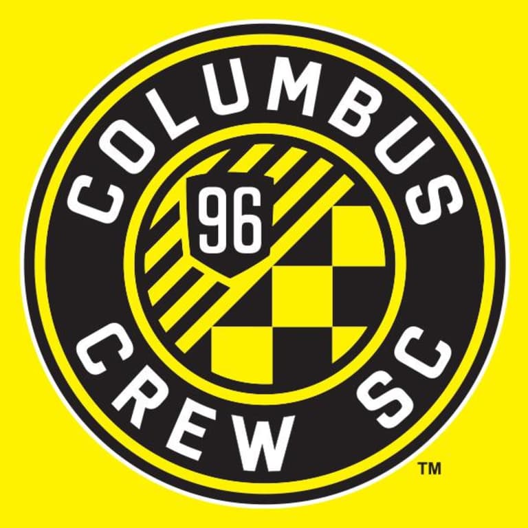
I honestly didn’t expect to love it right away, if for nothing else than it was something other than the symbol that I associate with 19 seasons of games, people, emotions and memories. I knew virtually any new logo would be a vast improvement in an objective sense, so in that way I was looking forward to the change, but I figured it would take a little while for my heart to come around. I assumed it would take some time to build the neural pathways needed to connect the new badge to nearly two decades of my life. I’m way ahead of schedule.
The thing I love about the new badge is that it immediately makes sense. Sometimes you see a new logo and it tells you absolutely nothing from looking at it, but then it is accompanied by reams of flowery explanation that, even after you wade through it, still reveals nothing when you look at the actual logo.
The Crew’s new badge is the opposite of that. Without a word of explanation, I could have picked out almost all of the graphical elements. First and foremost, unlike the original logo, the new badge answers the who/what/where questions. At first glance, most anyone from most anywhere can discern that this is the logo of a soccer team from Columbus. That in and of itself is a major improvement.
Unprompted, I could immediately pick out other design elements as well. The circular shape / inner ring immediately jumps out as the “O” for Ohio and the Ohio stage flag. (The Crew also say the circle is for the inclusive and uniting nature of a tight knit group—so something akin to an “inner circle”—and I think that fits well with the evolution of the Crew name. I wouldn’t have gotten that unprompted just from looking at the badge, but it’s good to know and it fits.)
Other elements may not be apparent to a random person on the street, but would be immediately recognizable to Crew fans. The year of the club’s founding (’96) set into the shape of the original crest should jump out to any Crew fan and is the perfect nod to the club’s history. Likewise, the checkerboard pattern from the Nordecke flags also immediately popped out as a tribute to the fans. As a soccer fan, I also knew that most German soccer badges are round, so I could discern that the shape was likely a nod to the city’s German heritage.
The only design element I totally would have missed without a written explanation is the significance of the nine diagonal stripes. The upward trajectory of those stripes symbolizes the Crew progressing upward and onward as a club.
(Tangent: I’m glad the Crew did their “upward trajectory” thing with stripes. The first time I ever came across an organization citing “upward trajectory” in a logo was when the NHL re-did theirs. The letters NHL used to go top to bottom as you read left to right across the shield, but now they go bottom to top as you read left to right. Basically, it’s the opposite of all of our reading norms and conventions. When I look at the NHL logo, I do not think, “Wow! This league is on an upward trajectory!” Instead, I think, “Why is the lettering going in the wrong direction?” So again, the Crew were smart to do the upward trajectory thing with stripes, not words.)
All in all, I think it’s incredible that the Crew incorporated so much into the new badge and all but one graphical element of it would make immediate sense to me without a single word of explanation. And the explanation of that one non-immediate element makes sense once you read about it.
Most importantly, the whole thing just looks good. And the wordmark is stunning, with a big bold “COLUMBUS” arched to reflect Columbus’ nickname, the Arch City, along with “Crew SC” to denote the soccer club.
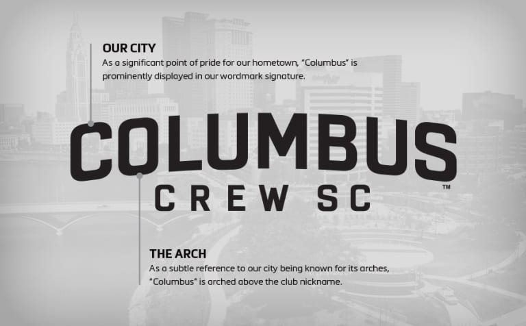
As the Crew redefine its organization, one of the things the club is striving for is to be “authentically Columbus.” Not only is that incorporated in the new badge and wordmark, but the mere creation of those items was indeed authentically Columbus. The Crew declined to use major design firms from New York or Los Angeles. Instead, the organization conducted their own research and entrusted the bulk of the design to their own creative services team—Columbus natives Will Bennett and Eric Sinicki.
This new badge was made in Columbus, by Columbus, for Columbus.
*
Here’s something I thought about on the drive home Wednesday night at the end of a historic evening…
Even though it’s not even been a year-and-a-half, it seems like a lifetime ago that Anthony Precourt bought the Crew and many people worried about the intentions of an out-of-towner that nobody here had ever heard of. If you’ll recall, even Mayor Coleman’s first question upon meeting Precourt in 2013 was whether he planned to keep the Crew in Columbus.
In the first few months after the sale, I either witnessed or heard stories about Precourt that quickly eased my mind. Not only was he saying all the right things, but his actions backed up his words. He’s a guy who cares about the entire club – top to bottom – and he cares about Columbus. He truly does view himself as the steward of a community asset.
As I thought about the successes that the Crew have enjoyed in 2014 while driving home that night, whether it be on the field, at the gate, or the launch of the new badge, it struck me how much of that success has come from within.
Precourt and new Sporting Director and Head Coach Gregg Berhalter could have gutted the entire office and team during the 2013-14 offseason, determined to install “their people” in a complete reboot.
Sure, there was some player and staff turnover, including the three remaining Massive Champion players and the stepping down of President and General Manager Mark McCullers, but on the whole, the Crew has made giant strides from within. On the field, some of the biggest breakout players have been Ethan Finlay, Justin Meram and Tony Tchani, all of whom are in their third or fourth year with the Crew, but are now flourishing under Berhalter. Those five sellouts (so far) in 2014 are the result of the hard work being done under Vice President of Ticket Sales, Services, and Operations Clark Beacom. The runaway success of the new brand rollout, from the creation of the badge, to the teasers leading up to the event, to the huge reveal party at the LC, and to all of the publicity afterwards was the result of lots of great work from people like Will Bennett, Eric Sinicki, Mike Malo, Arica Kress, Megan Kingston, Alex Caulfield, Tim Miller, and on and on and on. These are all people that predate Precourt.
Precourt, Berhalter, and now new President of Business Operations Andy Loughnane, have put a lot of effort into redefining the culture and internal/external brands of the Columbus Crew, yet they’ve kept in place so much of what already existed. There hasn’t been change for the sake of change, but rather they’ve largely built upon the players and staff and fans and community and family that were already in place when they got here. It’s one thing for new leaders to blow everything up and start over, but it’s an entirely different level of people-focused leadership to bring everyone along with you. The highest compliment I can pay to anyone and everyone associated with the club—from top to bottom, from the teams side to the office side to the community side—is to note that #NewCrew has grown and evolved right out of #OldCrew.
It took me years to find meaning in that hardhat logo, and part of me is always going to love and miss it despite its numerous flaws, but by the time I got home on Wednesday night, I had already found meaning in the new badge. Not only in the obvious things like the city name, the inner ring, the old logo shape, and the checkerboard, but even in the one thing I wouldn’t have noticed if it hadn’t been explained—those upward trajectory lines. Just as I came to see the Crew Stadium construction workers whenever I looked at the old logo, when I look at the new badge, I see those lines and think of all the people that made the new brand and Wednesday’s event such an unqualified success.
I will always think of them and how one perfect night appears so emblematic of the bright future that awaits our city and our Crew.
Questions? Comments? Relieved that the new badge wasn’t brown and green with a hardhat-wearing unicorn playing one of those 1980s keyboard guitar things while jumping a motorized shopping cart with soccer ball hubcaps through a flaming hoop set on top of the Leveque Tower? Feel free to write at sirk65@yahoo.com or via twitter @stevesirk.
Steve Sirk’s new book, “Kirk Urso: Forever Massive”, is available at the Crew Gear store or by ordering online HERE. All proceeds go to the Kirk Urso Memorial Fund for congenital heart defect research.
