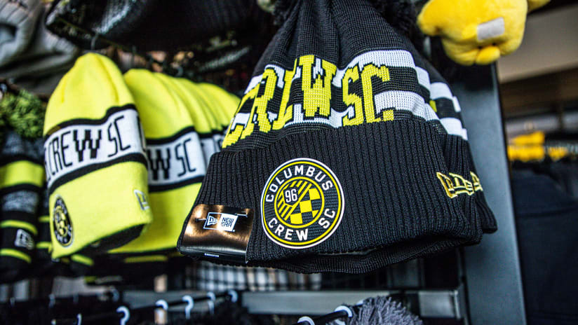
You've seen the street ads, digital billboards and social teaser campaigns: #NewCrew is coming. Next Wednesday, the Columbus Crew's new brand and visual identity will be revealed and all the speculation will end. Until that time, TheCrew.com's Ryan Schwepfinger is your go-to source for an inside look at the club's new identity and the process of bringing it to life, with a multi-part series entitled "Behind the Brand."
"We're looking at ways we can evolve and change our logo. We want it to represent the Columbus we've come to know. I don't think a construction crew is really representative. [Columbus is] not a blue-collar, manufacturing, industrial town. It's a smart, young, progressive university town with world-class businesses. It's a white-collar town. We want to be representative. We don't see Columbus in the crest. There are things we can do to represent the capital city better.”
Those were the words of Anthony Precourt to FOX Sports' Kyle McCarthy some eight months ago. It hasn't been a secret that the Crew is evolving its identity -- a brand that will be displayed publicly for the first time in just a few short days. What has been a secret is how the Black & Gold went about this evolution. The #NewCrew journey, a process far more intensive than merely designing an aesthetically pleasing logo, is about to be revealed.
Every good brand has a story to tell. Logos are more than logos; they mean something. The best have details rich with intrinsic meaning that go beyond the physical design elements. Along the same lines, changes aren't made merely for the sake of change. The Crew organization has carefully poured research, meaning and time into the new brand, dating back roughly two years ago.
While Precourt was influential in spurring the overhaul upon his purchase of the club in summer of 2013, the initial market research to determine that the Crew's brand needed a change was conducted as early as November of 2012. The club performed an analysis of the Crew brand as it existed, seeking to find out what fans thought of every aspect of the organization, including the logo, colors and what words came to mind when thinking about the Crew.
"Some of those early insights planted the seeds that there were some challenges we're facing with our brand," said Mike Malo, the Crew's Senior Vice President and Chief Marketing Officer. "There seemed to be a deterrent from us progressing and making an emotional connection with our brand."
What insights were there? The surveys revealed a clear impetus for change, namely among the 18-34 age group, otherwise known as millenials, an emerging and extremely important demographic for the soccer revolution in the United States. This age group said that they liked the Crew's current logo the least while simultaneously liking its Black & Gold color scheme the most.
"[Milennials] are one of our emerging demographics," said Malo. "They're one of the fastest-growing fan segments across the League. That fan segment liked our logo the least and that was a red flag for us. We have this important segment of our fanbase telling us that they didn't like our logo that much."
It wasn't just milennials that influenced the change: the overall average of logo approval among all fans checked in below the Crew's expectations for being a celebrated brand within the marketplace. It was then that the club knew a strategic re-aligning was needed.
The Crew thought about why that might be the case, why the current logo was not resonating in the marketplace. In the end, it boiled down to Columbus as a city.
"Columbus is starting to come of age with its brand," said Malo. "People are starting to have strong feelings of pride about being from Columbus and being proud of some of those elements. Now, we have an opportunity to align with our city too. Columbus, for a long time, had an identity crisis and it wasn't defined what we were as a city. Now, that's becoming defined."
The club realized that several problems existed with its current crest. For one, it doesn't include the word "Columbus." The Crew wanted its logo to embrace the surge of civic pride currently resonating within its community. The crest as it stands now could realistically be used for any city or for any team. A growing Midwestern market, people are proud to be from Columbus and those who live here know what a gem it truly is. The Crew knew its mark needed to embody that pride.
Not only that, but the club realized that nothing about it inherently represented even what sport the Crew played. The club's research revealed that there was confusion about what the logo stood for and what it meant -- did the word "Crew" mean that this mark was for a rowing team? What did the construction workers mean? The blue-collar nature of the logo didn't fit the emergence of Columbus as a progressive community.
The decision to create a brand-centric organization and evolve the club's identity was thusly made. When Precourt took over the club, the foundation and the reasoning for the brand evolution was in place and the process of physically designing the mark and its accompanying narrative began.
