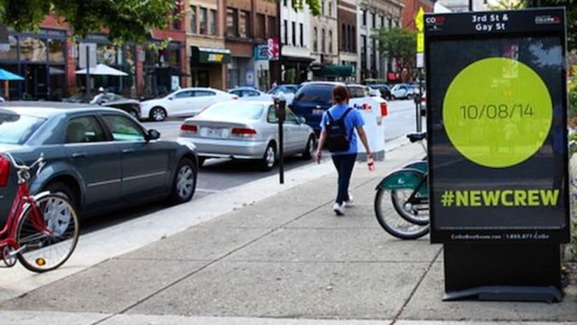
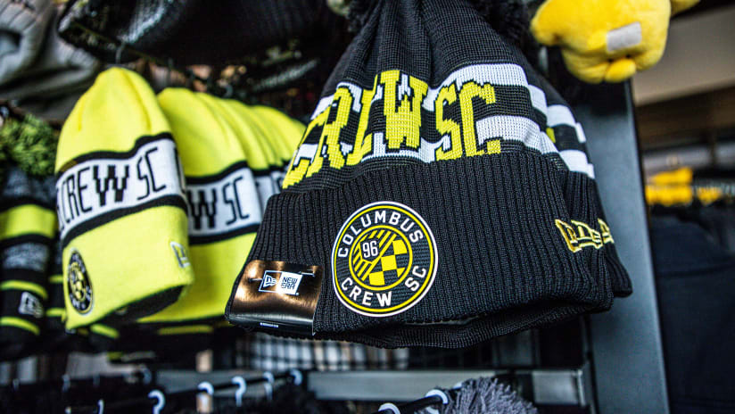
You've seen the street ads, digital billboards and social teaser campaigns: #NewCrew is coming. On Wednesday, the Columbus Crew's new brand and visual identity will be revealed and all the speculation will end. Until that time, TheCrew.com's Ryan Schwepfinger is your go-to source for an inside look at the club's new identity and the process of bringing it to life, with a multi-part series entitled "Behind the Brand." Part I of the series told of the club's motivation to make a change.
With clear evidence in hand as to why the Columbus Crew needed a brand evolution, the fun part of the process began: brainstorming ideas and wondering exactly what the club could become. A brand evolution in this sense is like an open canvas. The club had the opportunity become anything it wanted, a chance to capture a burgeoning market in a sport that is hitting its prime in the United States -- a tremendous opportunity, to be sure, and one that it did not want to let slip away.
The brainstorming process for the Crew's brand evolution, which began in August 2013 with the "inspiration phase," left no stone unturned. First, the club gathered as much existing information as it possibly could in terms of the designs used by teams all around the world, and not just from soccer.
The Crew brass looked first at the logo designs of all competitors in the market, spanning from the Blue Jackets and Clippers to professional teams in Cincinnati and Cleveland. It also looked at all other MLS clubs as well as badges from European clubs in each and every top league. The club even considered fan designs that had been popping up for a while on the Internet and social media.
The Crew did not merely look at the designs in the sense of what looked good, they studied them in-depth. Patterns were noted. Themes were considered. The brands that had strong narratives behind them were particularly observed, because the Crew wanted to weave its own narrative as part of a focus on becoming a brand-centric organization. The design team even went as far as to superimpose all of the marks from each league on top of one another to see what shapes and designs stood out. The club noticed that many leagues featured an varying distribution of shapes, while others seemed to have recurring designs.
With all of these competitors' designs, there was one simple question that needed to be answered when it came to the new Crew badge: what could the Black & Gold own? What motifs, themes or designs were common among all comparable marks, and what could become uniquely Crew?
As one example, the club determined that the letter "C," for Columbus, was not something it could uniquely own, as many competitors (Clippers, Blue Jackets, Indians, Reds) all utilize the letter as an identifying characteristic. The Crew wanted to be distinctly Columbus but also distinctly Crew and distinctly Ohio. The club wanted to have a distinguishable crest both within MLS and also within the local market.
To that end, the Crew next sought inspiration in the form of thematic elements that tied together important motifs from the city it calls home. The Crew's internal creative services team went out into the city themselves and took pictures of recurring elements in architecture, design and function.
Among the elements that were photographed and studied in-depth: the typography, fonts and design of the German Village and Brewery District, the symbolic arches of the Short North (key to Columbus' revival as the "Arch City"), keystone elements, the fact that Columbus is the capital of Ohio and the eagle motif therein, the circular shape as evident in the state flag, the unique fan culture of Crew supporters themselves and finally, nautical elements visible around the city. Not all of these elements made it into the final design, but many did in some shape or form.
Motifs in hand, the club next began to create actual designs. Many redesigns go through outside sources or design firms, with the club receiving concept options and signing off on what it likes best. The Crew decided to take a different approach, opting to have its internal design staff conjure each and every concept. This was done with the belief that outside firms would not know Columbus, the Crew and each of their cultures like those who live and work here.
“We certainly considered going externally. As much as we took that into consideration, we at least wanted to take a stab at it internally, because we felt like we had the right people with the right skills that really had an intimate knowledge of the direction we were heading as a brand, as well as a strong historical knowledge of the club,” said Mike Malo, the Crew’s Senior Vice President and Chief Marketing Officer. “In the end, it was the right choice [to keep it internal] and we’re very proud that we accomplished this with our own people.”
After more than 100 concepts and 12 phases of editing, the new badge that you will see on Wednesday came to life.
